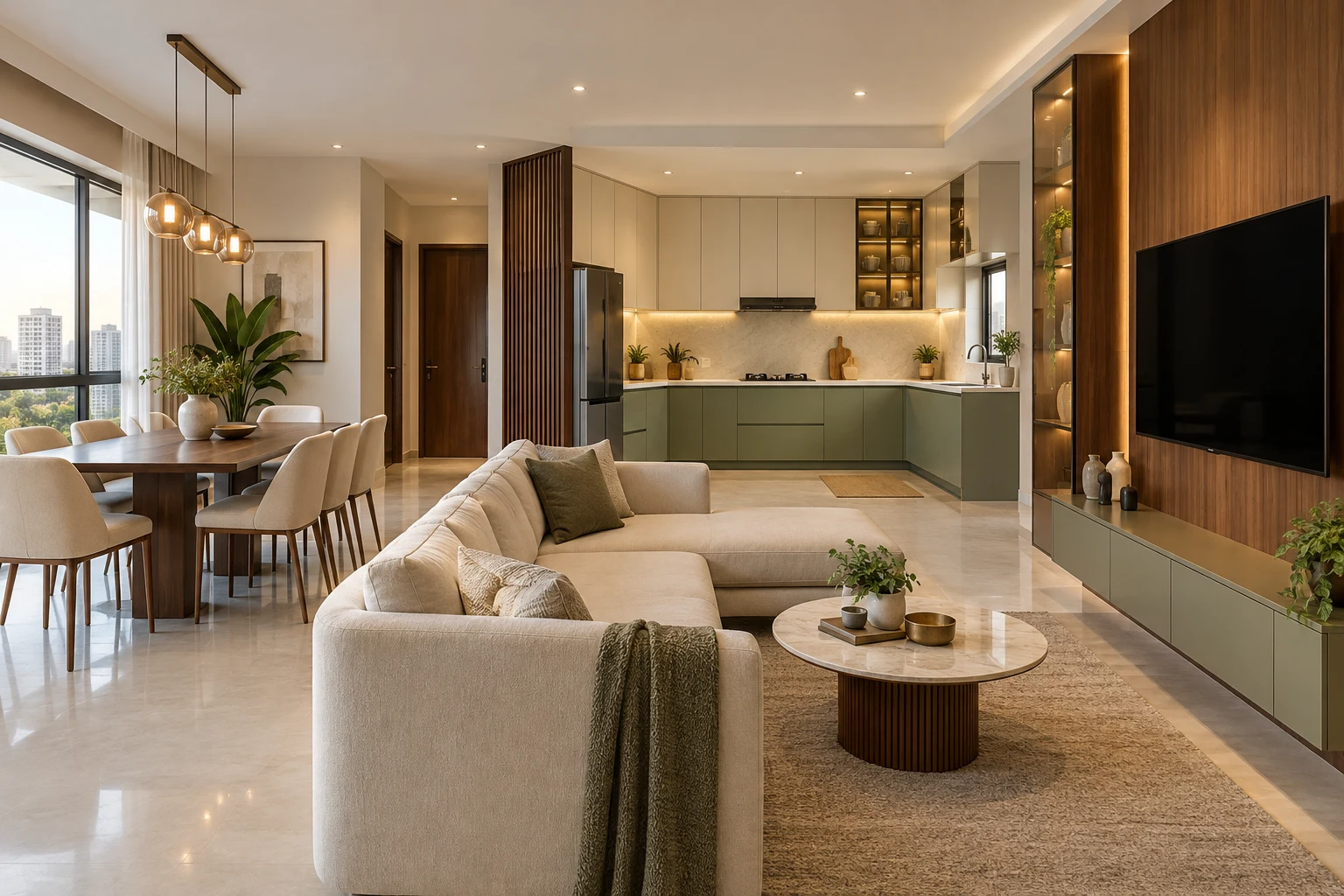

Choose a palette you can live with.
We help coordinate metal finishes with flooring, wall colour, countertops, lighting and the rest of your home—then approve samples before production.
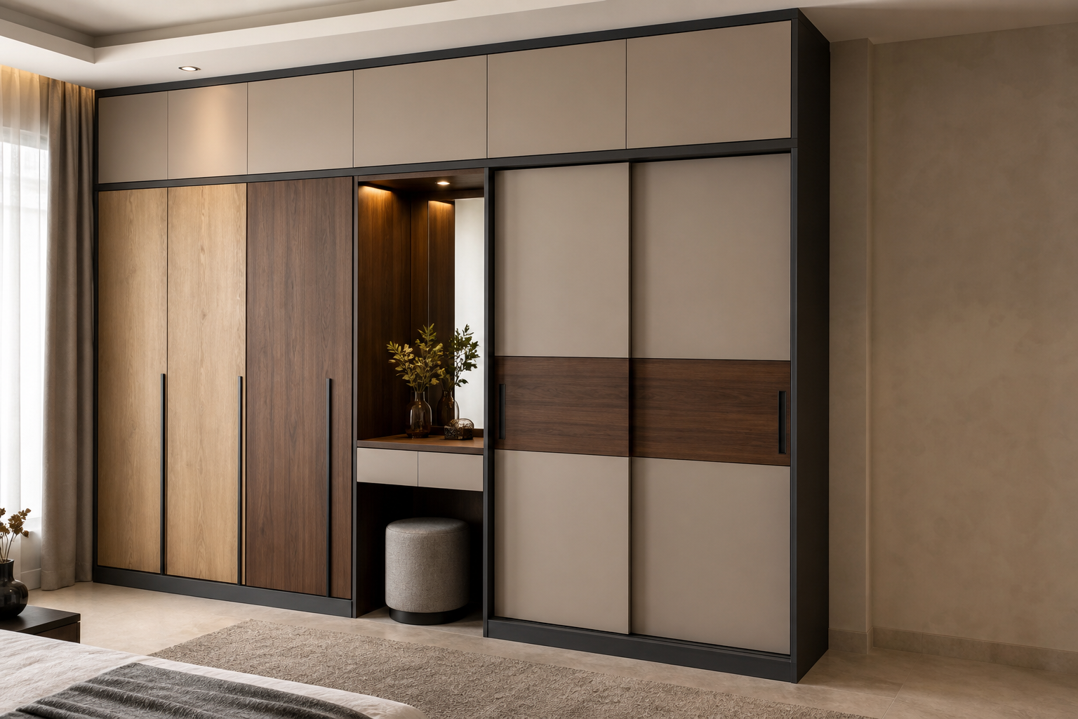
Four useful palette directions.
Warm neutral
Soft beige and off-white for calm, bright interiors.
Soft colour
Muted greens or blues paired with a quiet neutral.
Deep contrast
Graphite and charcoal used selectively for definition.
Wood warmth
Wood-grain accents balanced with durable metal structure.
Sample first. Manufacture second.
Screen colours can vary. Final decisions are based on finish references viewed with the room’s flooring, light and adjacent materials.
Fix the base tone
Start with flooring, walls and countertops—the largest visual surfaces.
Add one supporting finish
Use wood grain, glass, acrylic or a second colour with restraint.
Approve the sample
Record the final finish code before factory production begins.
Bring your room palette together.
Share flooring, wall and countertop references. We will help narrow the finish direction.